Sarvita · Design System
Bold blocks.
Bold blocks.
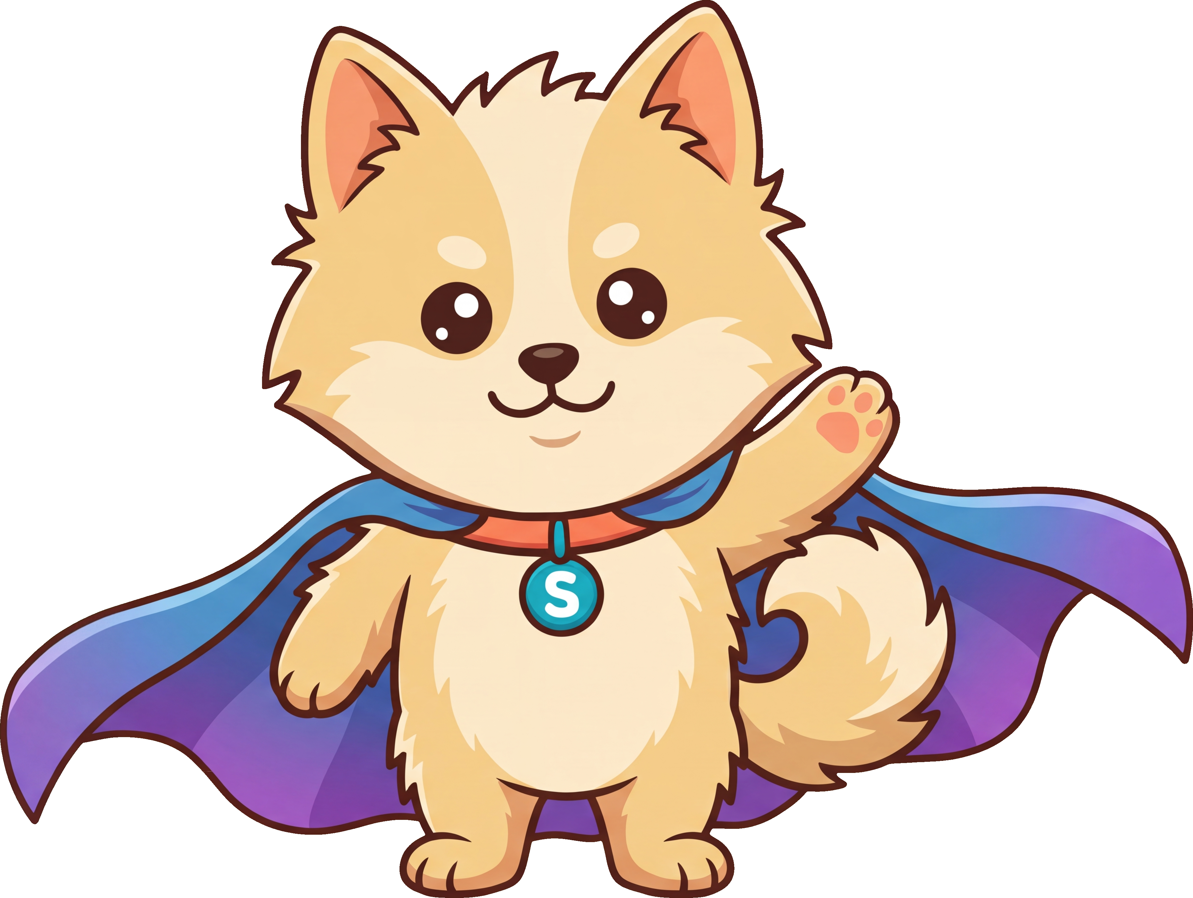
Good boy.
Playground is the visual language for every Sarvita surface: saturated color blocks, hard cut-out shadows, chunky rounded geometry, and a voice set in Bricolage Grotesque. Color is always a flat block — never a cross-fade — and the warm cartoon Sar finally feels at home.